
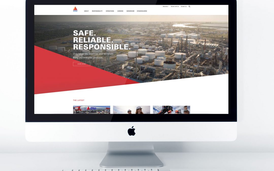
I contributed to the design and front end development of CITGO Petroleum’s corporate website, helping organize a broad collection of corporate, operational, community, newsroom, and customer content into a clearer and more consistent digital experience.
The project required balancing the scale and authority of a major energy company with an interface that remained approachable, responsive, and easy to navigate. Every page needed to support the larger CITGO brand while guiding visitors toward the information most relevant to them.
01 · The Challenge
Making a complex corporate website feel clear
CITGO serves several audiences, including customers, business partners, job candidates, members of the media, employees, and the communities surrounding its operations. The website needed to communicate a large amount of information without making visitors work to understand where they should go next.
The challenge was to create a cohesive visual and navigational system that could accommodate corporate information, operational content, community initiatives, news, careers, and consumer resources while maintaining a recognizable CITGO presence.
02 · The Approach
Building clarity through hierarchy and consistency
I approached the project by focusing on content hierarchy, visual consistency, and reusable page patterns. Strong headings, purposeful imagery, structured content areas, and clearly defined calls to action helped visitors scan each page and understand the available paths.
The interface incorporated CITGO’s established visual identity while creating enough flexibility to support different types of content across the website. Responsive layouts ensured that the experience remained usable and visually consistent across desktop, tablet, and mobile screens.
03 · The Solution
A corporate experience designed to inform and guide
The resulting website presents CITGO’s corporate story through a more organized and visually unified framework. Content is divided into meaningful sections, allowing visitors to move more easily between information about the company, its operations, social responsibility, newsroom content, career opportunities, and customer resources.
The design uses bold corporate imagery, structured layouts, recognizable brand elements, and consistent interface patterns to establish trust while keeping the experience approachable. The system also provides a scalable foundation for additional content and future website updates.
04 · My Contribution
Where design and development came together
My contribution brought together visual design, user experience thinking, content presentation, and front end execution. I worked to ensure that the website did more than reflect the CITGO brand. It also needed to function as a practical communication tool for a broad and diverse audience.
From page hierarchy and responsive behavior to visual consistency and content readability, each decision supported a corporate experience that feels intentional, dependable, and easier to use.
05 · The Result
A stronger and more cohesive digital presence
The completed work provides CITGO with a clearer and more cohesive corporate presence. Visitors can explore the company and its initiatives through a structured experience that supports readability, brand recognition, and easier access to important information.
The project reflects the principle that guides much of my work: complex information does not need to feel complicated. With the right hierarchy, visual system, and technical foundation, a large corporate website can remain both powerful and approachable.