
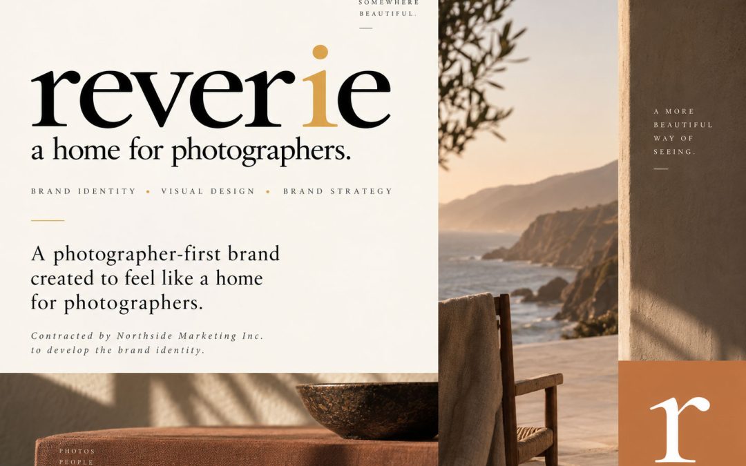
I was contracted by Northside Marketing Inc. to develop the brand identity for Reverie, an emerging photography platform designed to give photographers a more thoughtful way to present their work, serve their clients, and build a professional presence of their own.
The identity was created around a simple idea: photography is personal, and the place that holds it should feel personal too.
01 · The Challenge
Creating a brand that supports the photography
Reverie needed an identity that could speak to professional photographers without competing with the work they create.
The brand had to feel elevated and artistic while remaining flexible enough to grow into a much larger digital platform. It needed to work across photographer galleries, client experiences, print materials, packaging, social content, ecommerce, and future digital products.
The challenge was creating something recognizable without making the brand louder than the photography itself. The photographer and the work had to remain the focus.
02 · The Approach
Building an identity through restraint and perspective
I approached Reverie as more than a logo project. The goal was to develop a visual language rooted in the same qualities found in strong photography: composition, restraint, contrast, emotion, and perspective.
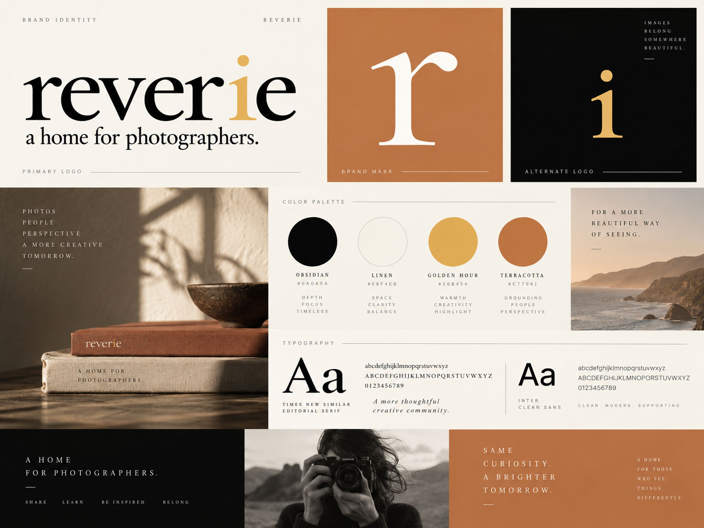
The lowercase wordmark gives the brand an editorial character while maintaining warmth and approachability. A restrained palette of black, warm cream, terracotta, and muted gold creates an environment that feels sophisticated without becoming sterile.
The gold accent within the wordmark adds a small moment of distinction, while the standalone lowercase r gives Reverie a flexible brand mark for digital interfaces, packaging, social media, stationery, and physical materials.
Throughout the system, generous space and understated typography allow photography to remain the visual hero.
03 · The Solution
A flexible identity for physical and digital experiences
The resulting identity is built around a visual system capable of moving naturally between physical and digital environments.
The primary Reverie wordmark establishes an editorial and sophisticated presence, paired with the positioning line, “a home for photographers.” The standalone r creates a secondary identifier for smaller applications, while the supporting color and typography system gives the brand consistency across every touchpoint.
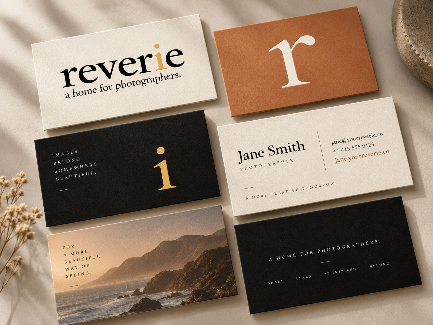
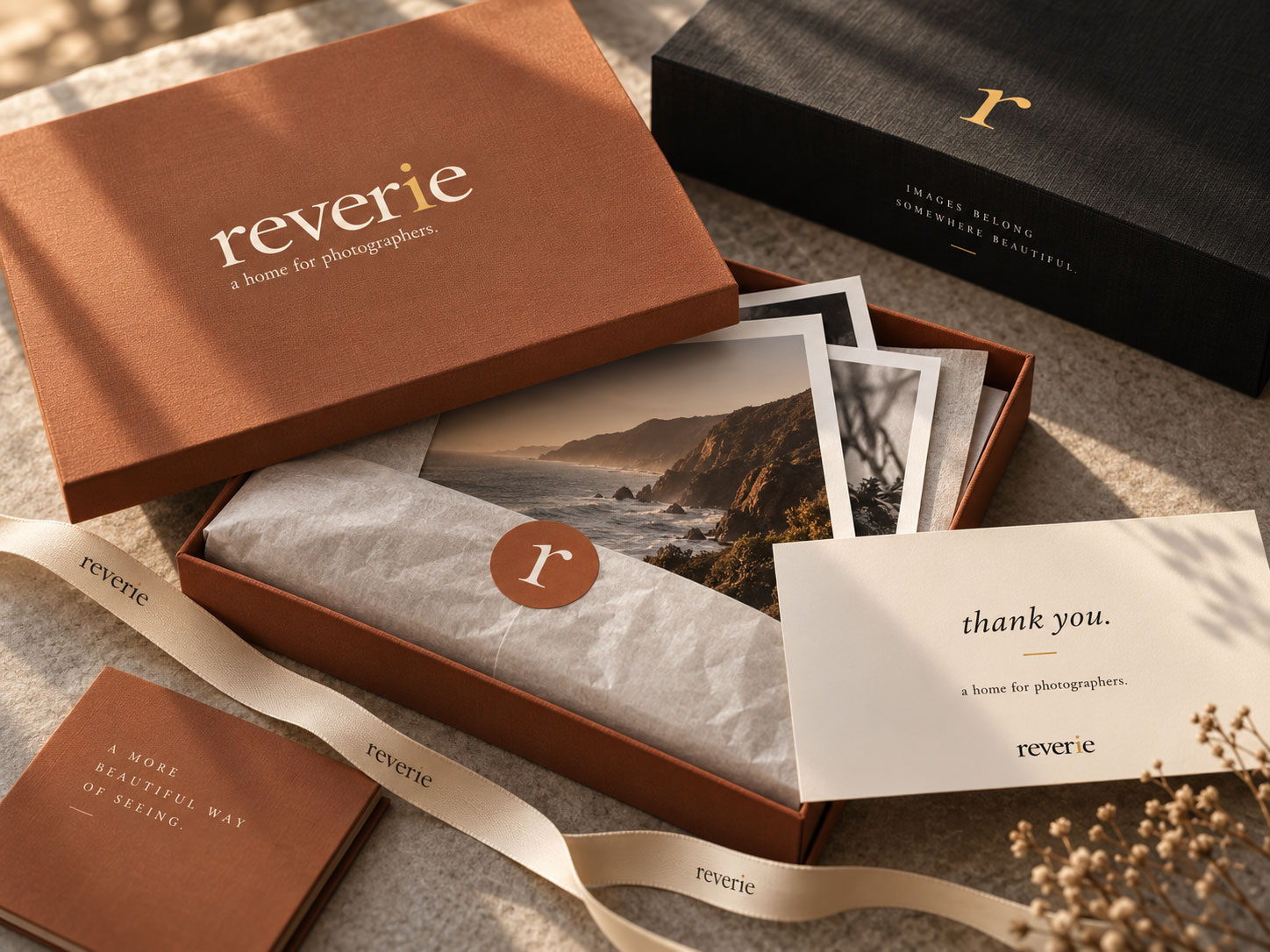
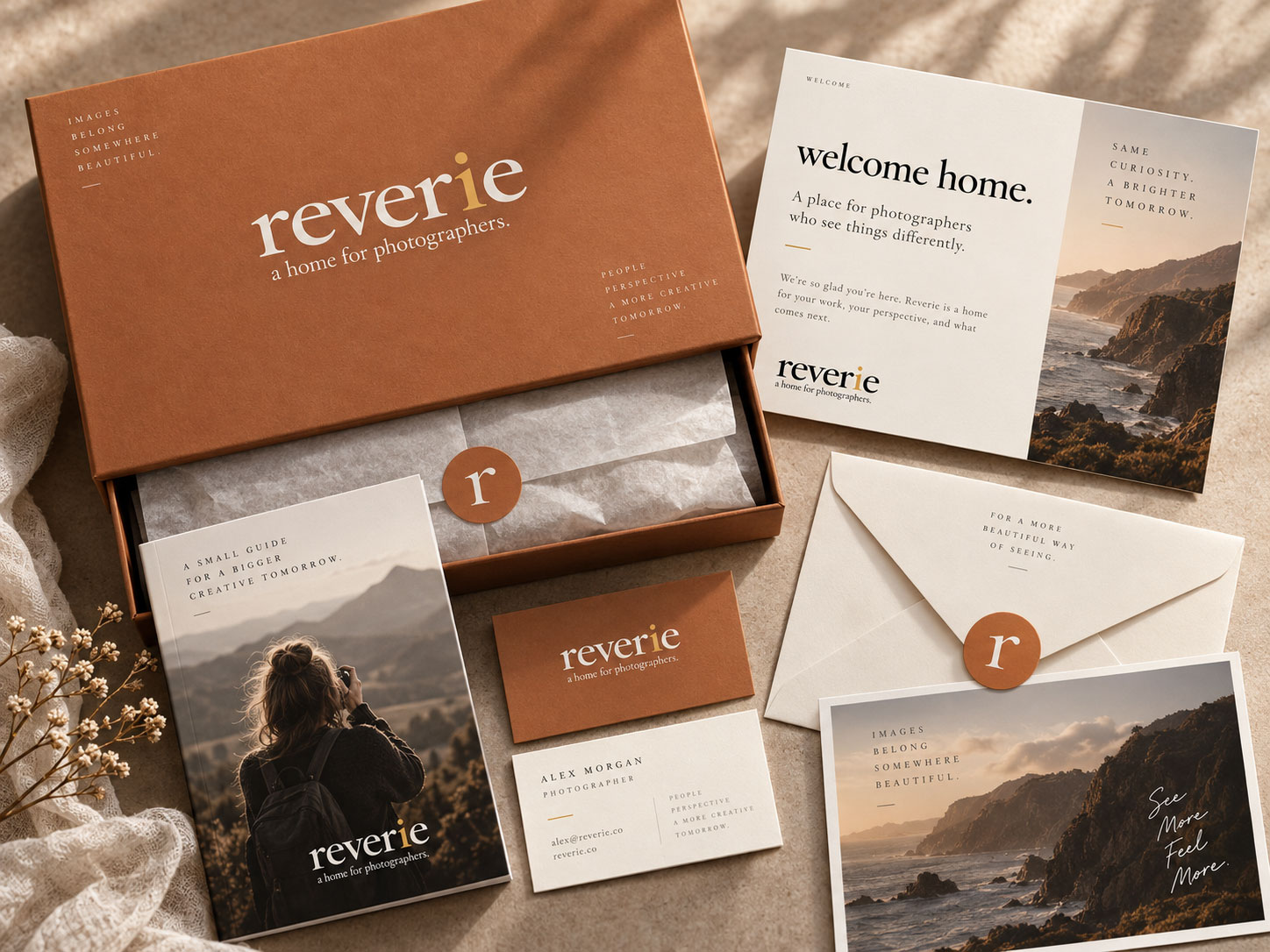
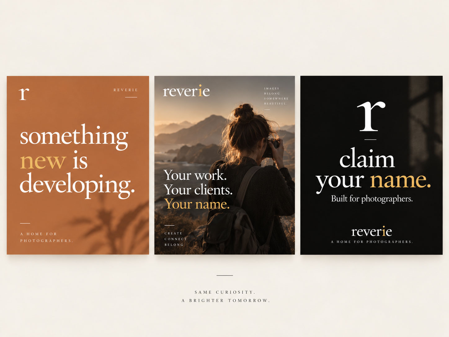
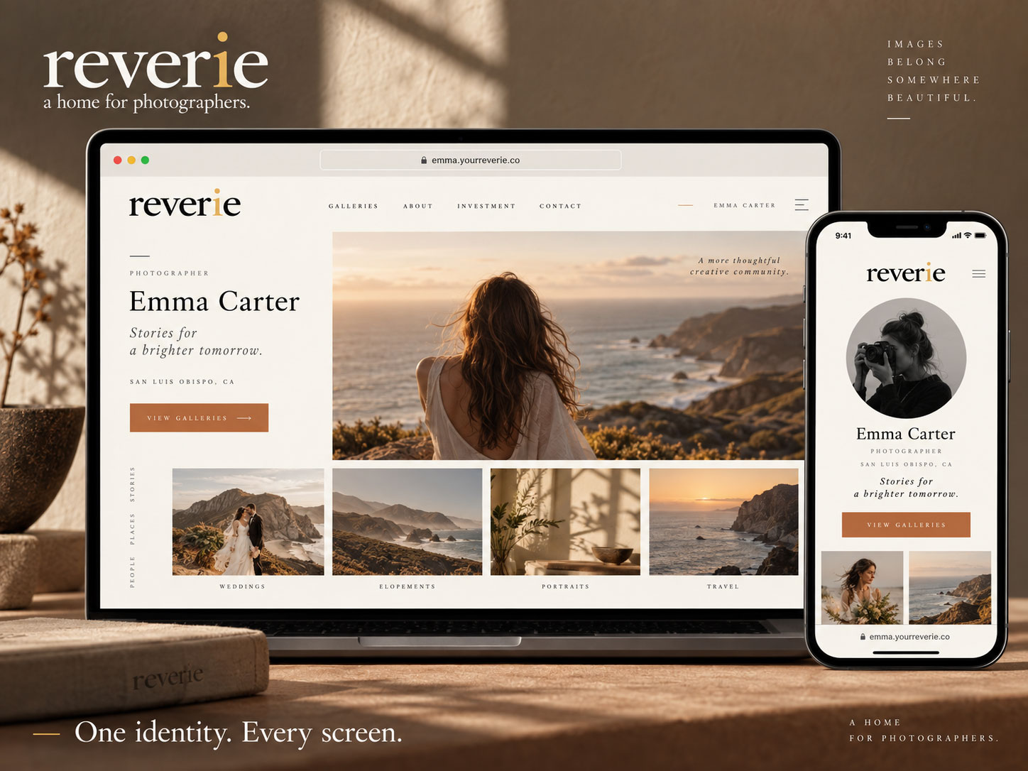
To demonstrate how the identity could expand beyond the logo, I developed applications for photographer welcome materials, business cards, stationery, fine art print packaging, client delivery materials, social campaigns, gallery interfaces, responsive digital experiences, and brand guidelines.
The system was intentionally designed so that Reverie provides the framework while each photographer’s work remains central.
Project Gallery
04 · My Contribution
Developing the brand from strategy through application
- Brand strategy: Defined the visual direction, creative positioning, and photographer focused philosophy behind the identity.
- Visual identity: Developed the Reverie wordmark, secondary brand mark, logo variations, and supporting identity system.
- Color and typography: Established an editorial visual palette designed to complement photography without overpowering it.
- Brand applications: Created concepts showing how the identity could extend across stationery, packaging, photographer welcome materials, social media, galleries, and digital environments.
- Digital design direction: Explored how the identity could translate into photographer profiles, client galleries, responsive interfaces, and future platform experiences.
- Creative direction: Established the photography, composition, typography, and visual language used throughout the broader brand system.
05 · The Result
A distinct identity designed to stay out of the way
The final identity gives Reverie a foundation that feels distinct without becoming intrusive. It can live quietly beside a photograph, expand confidently across packaging and print, or provide structure for a larger digital experience.
Most importantly, the identity supports the philosophy behind the platform: your work, your clients, your name.
Reverie becomes the environment around the photographer rather than the center of attention. As the business continues to develop, the brand system provides a flexible foundation for photographer portfolios, client galleries, print fulfillment, ecommerce, social communication, and future platform experiences.
A home for photographers, built around the photographers who use it.